Triple Whale
Marketing site for leading e-commerce analytics platform with complex pricing tools and integrations.
Triple Whale hired a design-only agency to rebuild their marketing site. The result looked great but performed badly: slow load times, no accessibility compliance, and weak SEO. They found me on Upwork and asked me to rebuild the site from the ground up into something fast, inclusive, and easy to maintain.
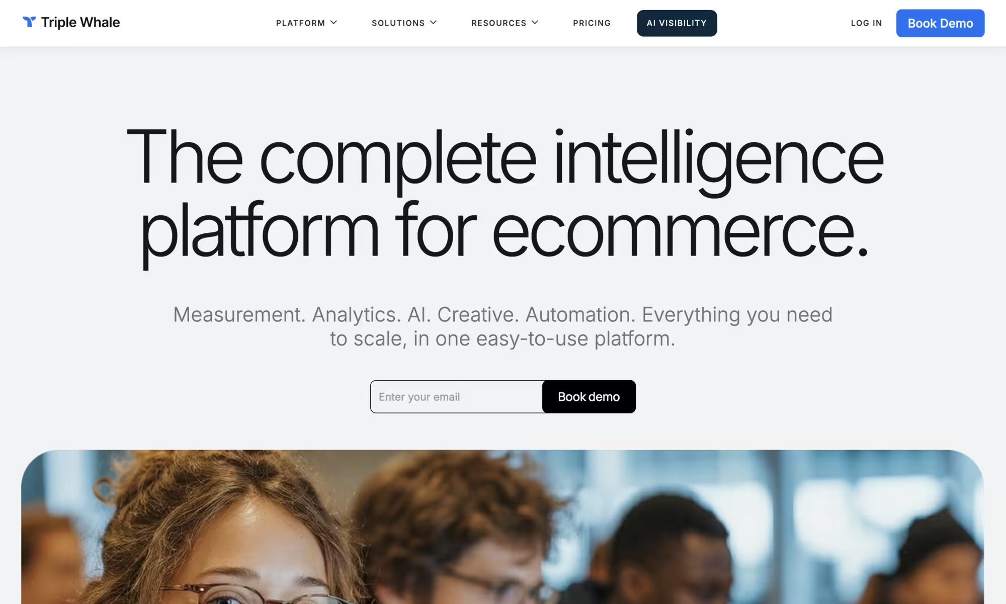
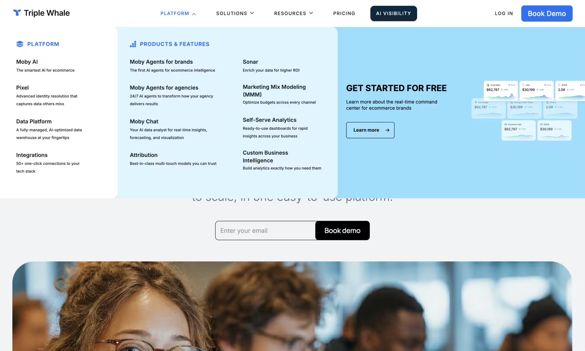
I also had the freedom to propose improvements of my own, including a new navigation system and more personalised user journeys that better reflected Triple Whale’s position as a leading ecommerce analytics platform.
What we did
Over-reliance on heavy, buggy, Chrome-only CSS animations.
Rebuilt the site with a focus on performance, accessible interaction patterns, and clear content hierarchy, using simple, robust animations only where they genuinely added value.
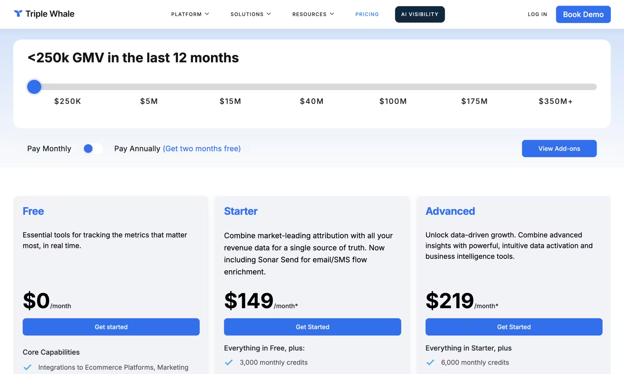
A confusing pricing table with too much fine print and no clear “what does this cost me?” answer.
Redesigned the pricing experience around a clear, unobtrusive cost calculator. Users can now adjust for gross sales, billing frequency, and discounts, and immediately see what they’ll pay. This change reduced bounce rate on the pricing page by 40%.
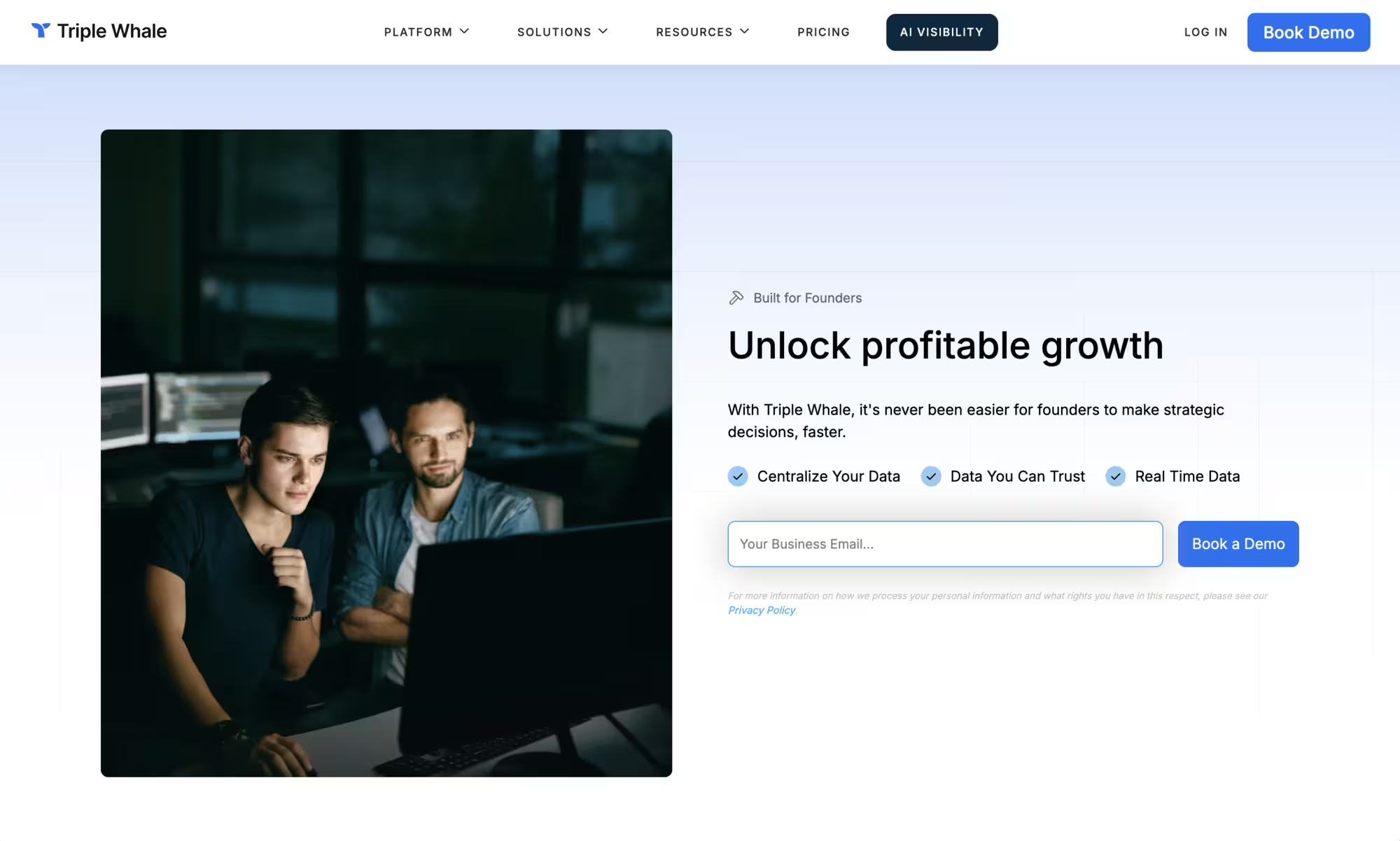
Important landing pages were hard to find and didn’t guide users towards a next step.
Redesigned the information architecture to surface industry- and size-specific landing pages, added clear navigation paths into them, and created personalised sales flows with explicit, relevant CTAs.
The Results
The rebuilt site launched to immediate positive feedback from the Triple Whale team. The new site is faster, more stable, and better optimised for user experience and SEO. Users are more engaged and spend longer on-site with each visit.
The numbers told a clear story. Page load times dropped by 60%, search-driven conversions increased, and the cost calculator reduced bounce rate by 40%. The new CMS-based architecture also gave the team the flexibility to ship new content without being constrained by awkward editorial limitations.
Overall, the new site finally matches Triple Whale’s position as a tech SaaS leader: fast, clear, and trustworthy.